|
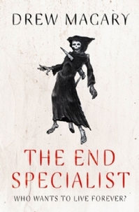
They say you can't, but they're clearly wrong. I judge books by their covers all the time – in the library, in shops, on other people's shelves. It's one area where my Kindle just can't give me the same experience as the real thing. A good cover is like walking into a hotel room and finding a freshly made bed with one corner of the quilt turned back: it invites you to climb inside. A bad cover, on the other hand, is like walking into the same room and finding a bed that someone else has just slept in: it leaves you with no desire to linger. I hate to say it, but this is where self-published books often fall down. Authors tend to assume they can do everything, but the truth is that designing the cover is as much a specialist skill as writing the book in the first place. The font, the image, the layout: get any of them wrong, and your cover will look amateur. And if there's one thing a self-published author doesn't want, it's to look amateur. Personally, if I don't like a book cover, I'll probably ignore the book. And if I think a cover looks unprofessional, I tend to assume what's behind it is unprofessional as well. You can write the best book in the entire universe, but if the cover looks like it was knocked up in two minutes using Photoshop, no-one will ever know how great you are. So what makes a good cover? I can only base this on my own preferences – because, of course, no matter how professionally done a cover is, there'll always be some people who don't like it – but here are some recent covers from publishers both large and small that really stood out for me.  The Forever Girl by Rebecca Hamilton I love this cover. I really do. The image is striking, chosen perfectly to appeal to the target audience. The font used for the book title is unusual and has some beautiful graphic touches. The whole thing gives a great flavour of what the book is about. If I saw this cover on a shelf in a store or library, I'd definitely pick the book up.  The End Specialist by Drew Magary In contrast to the last cover, this one is very minimalist. But the single image of the Grim Reaper being slain raises all kinds of intriguing questions (plus as it turns out, the same image is referred to in the book itself, which is always a nice touch). I like the font, as well – it adds to the illustrative, almost calligraphic effect. Rather like Japanese art, its very simplicity pulls me in.  The Knife of Never Letting Go by Patrick Ness I may be biased on this one, because I love the book so much. But there's an awful lot to like about this cover: the graffiti-like title, the scribbled confusion of text at the sides (which again turns out to mean something), the violent red slash of the knife across the whole thing. It's not obvious what the book is about, but the cover has a real atmosphere to it that makes me want to find out. What are some of your favourite recent covers? And what makes them good?
1 Comment
Katrina Jack
13/5/2012 02:56:16 pm
I think you're right, especially about e books. There's nothing more off putting than a bad cover. It's the first thing a potential reader will see and although it's a cliche, first impressions do count. I had to commission the cover for my book, as I can't draw a straight line with a ruler! That kind of thing's best left to the experts.
Reply
Your comment will be posted after it is approved.
Leave a Reply. |
Archives
July 2016
Categories
All
|
 RSS Feed
